QML Design Guidelines
An introduction to QML and additional documentation are available here
Mycroft-GUI frameworks provides you with some base delegates you should use when designing your QML GUI. The base delegates provide you with a basic presentation layer for your skill with some property assignments that can help you set up background images, background dim to give you the control you need for rendering an experience.
Before we dive deeper into the Design Guidelines, lets look at some concepts that a GUI developer should learn about:
Units & Theming
Units:
Mycroft.Units.GridUnit is the fundamental unit of space that should be used for all sizing inside the QML UI, expressed in pixels. Each GridUnit is predefined as 16 pixels
// Usage in QML Components example
width: Mycroft.Units.gridUnit * 2 // 32px Wide
height: Mycroft.Units.gridUnit // 16px Tall
Theming:
OVOS Shell uses a custom Kirigami Platform Theme plugin to provide global theming to all our skills and user interfaces, which also allows our GUI's to be fully compatible with the system themes on platforms that are not running the OVOS Shell.
Kirigami Theme and Color Scheme guide is extensive and can be found here
OVOS GUI's developed to follow the color scheme depend on only a subset of available colors, mainly:
-
Kirigami.Theme.backgroundColor = Primary Color (Background Color: This will always be a dark palette or light palette depending on the dark or light chosen color scheme)
-
Kirigami.Theme.highlightColor = Secondary Color (Accent Color: This will always be a standout palette that defines the themes dominating color and can be used for buttons, cards, borders, highlighted text etc.)
-
Kirigami.Theme.textColor = Text Color (This will always be an opposite palette to the selected primary color)
QML Delegate Design Best Practise
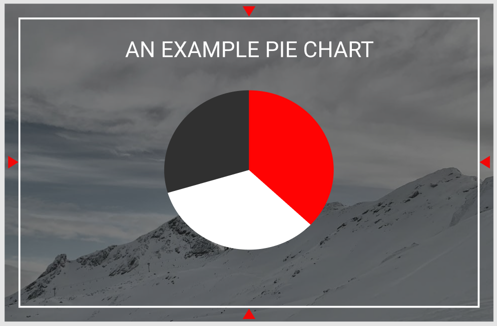
Let's look at this image and qml example below, this is a representation of the Mycroft Delegate:

-
When designing your first QML file, it is important to note the red triangles in the above image, these triangles represent the margin from the screen edge the GUI needs to be designed within, these margins ensure your GUI content does not overlap with features like edge lighting and menus in the platforms that support it like OVOS-Shell
-
The content items and components all utilize the selected color scheme, where black is the primary background color, red is our accent color and white is our contrasting text color
Let's look at this in QML:
import ...
import Mycroft 1.0 as Mycroft

Mycroft.Delegate {
    skillBackgroundSource: sessionData.exampleImage
    leftPadding: 0
    rightPadding: 0
    topPadding: 0
    bottomPadding: 0

    Rectangle {
        anchors.fill: parent
        // Setting margins that need to be left for the screen edges
        anchors.margins: Mycroft.Units.gridUnit * 2

        //Setting a background dim using our primary theme / background color on top of our skillBackgroundSource image for better readability and contrast
        color: Qt.rgba(Kirigami.Theme.backgroundColor.r, Kirigami.Theme.backgroundColor.g, Kirigami.Theme.backgroundColor.b, 0.3)

        Kirigami.Heading {
            level: 2
            text: "An Example Pie Chart"
            anchors.top: parent.top
            anchors.left: parent.left
            anchors.right: parent.right
            height: Mycroft.Units.gridUnit * 3
            // Setting the text color to always follow the color scheme for this item displayed on the screen
            color: Kirigami.Theme.textColor
        }

        PieChart {
            anchors.centerIn: parent
            pieColorMinor: Kirigami.Theme.backgroundColor // As in the image above the minor area of the pie chart uses our primary color
            pieColorMid: Kirigami.Theme.highlightColor // As in the image above the middle area is assigned the highlight or our accent color
            pieColorMajor: Kirigami.Theme.textColor // As in the image above the major area is assigned the text color
        }
    }
}
QML Delegate Multi Platform and Screen Guidelines
OVOS Skill GUIs are designed to be multi-platform and screen friendly, to support this we always try to support both Horizontal and Vertical display's. Let's look at an example and a general approach to writing multi resolution friendly UI's
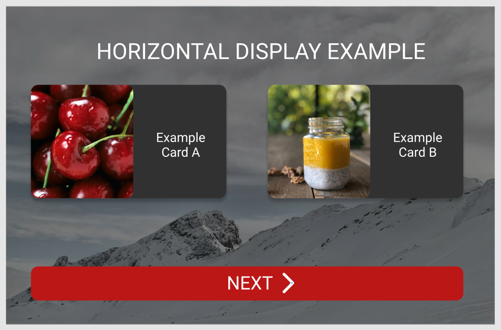
Let's look at these images below that represent a Delegate as seen in a Horizontal screen:

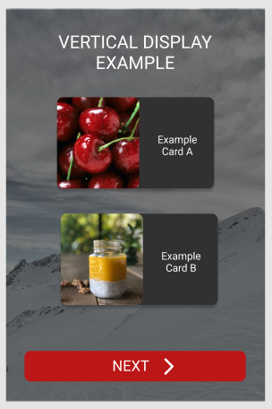
Let's look at these images below that represent a Delegate as seen in a Vertical screen:

- When designing for different screens it is preferred to utilize Grids, GridLayouts and GridViews this allows easier content placement as one can control the number of columns and rows displayed on the screen
- It is also recommended to use Flickables when you believe your content is going to not fit on the screen, this allows for content to always be scrollable. To make it easier to design scrollable content, Mycroft GUI provides you with a ready to use Mycroft.ScrollableDelegate.
- It is also preferred to use the width vs height comparison on the root delegate item to know when the screen should be using a vertical layout vs horizontal layout
Let's look at this in QML:
import ...
import Mycroft 1.0 as Mycroft

Mycroft.Delegate {
    id: root
    skillBackgroundSource: sessionData.exampleImage
    leftPadding: 0
    rightPadding: 0
    topPadding: 0
    bottomPadding: 0
    property bool horizontalMode: width >= height  ? 1 : 0 // Using a ternary operator to detect if width of the delegate is greater than the height, which provides if the delegate is in horizontalMode

    Rectangle {
        anchors.fill: parent
        // Setting margins that need to be left for the screen edges
        anchors.margins: Mycroft.Units.gridUnit * 2

        //Setting a background dim using our primary theme / background color on top of our skillBackgroundSource image for better readability and contrast
        color: Qt.rgba(Kirigami.Theme.backgroundColor.r, Kirigami.Theme.backgroundColor.g, Kirigami.Theme.backgroundColor.b, 0.3)

        Kirigami.Heading {
            level: 2
            text: "An Example Pie Chart"
            // Setting the text color to always follow the color scheme
            color: Kirigami.Theme.textColor
        }

        GridLayout {
            id: examplesGridView
            // Checking if we are in horizontal mode, we should display two columns to display the items in the image above, or if we are in vertical mode, we should display a single column only
            columns: root.horizontalMode ? 2 : 1

            Repeater {
                model: examplesModel
                delegates: ExamplesDelegate {
                    ...
                }
            }
        }
    }
}