Mycroft-GUI QT5
In a nutshell
Some OVOS devices have a screen. Qt5/QML is the legacy way to draw on it: a graphical toolkit where you describe what a screen should look like (text, images, animations, cards) in a markup language. This is the legacy screen path. It is deprecated, and a ground-up replacement is being built (see GUI Adapters), so treat the examples here as reference rather than something to build new work on. Voice, not the screen, is meant to be the main way you interact with OVOS. See the Glossary for terms.
The OVOS GUI is deprecated: see Screens on OVOS for the full picture
The Qt5/QML client described here is part of the legacy stack. There is no generally usable OVOS GUI. A replacement is in development.
The Qt5 gui-client is the only client that runs. Qt5 itself is deprecated upstream, and this client gets no updates. It is kept solely so existing (e.g. Mark 2) devices keep a screen.
Two replacement GUI clients are in development, both unreleased. Neither is usable:
- Qt6/Kirigami: mycroft-gui-qt6
(
feat/gui-protocol-rework), still needs a human C++/Qt6 build review. - pyhtmx (browser/HTMX):
pyhtmx-gui-client, a standalone web client speaking the legacy GUI websocket protocol (it is not a GUI-adapter plugin, see GUI adapters).
Until one of these ships, there is no maintained GUI client. See GUI Adapters for the rework architecture.
Introduction to QML
The reference GUI client implementation is based on the QML user interface markup language. It gives skill authors freedom to create in-depth, custom interactions, or to use simple templates within the GUI framework for a minimal display of text and images, depending on the skill's needs.
QML is a declarative language built on top of Qt. It describes the user interface of a program: both what it looks like and how it behaves. QML provides modules made up of graphical and behavioral building elements.
Before Getting Started
A collection of resources to familiarize you with QML and Kirigami Framework.
Importing Modules
A QML module provides versioned types and JavaScript resources in a type namespace which may be used by clients who import the module. Modules make use of the QML versioning system which allows modules to be independently updated. More in-depth information about QML modules can be found here Qt QML Modules Documentation
The code snippet example below imports some of the common modules that provide the components required to get started with a visual user interface. Every other QML example below starts from this same import block (dropping org.kde.lottie when Lottie animations aren't used); later snippets only show what changes below the imports.
import QtQuick 2.4
import QtQuick.Controls 2.2
import QtQuick.Layouts 1.4
import org.kde.kirigami 2.4 as Kirigami
import Mycroft 1.0 as Mycroft
import org.kde.lottie 1.0
QTQuick Module:
Qt Quick module is the standard library for writing QML applications. It provides a visual canvas and includes types for creating and animating visual components, receiving user input, creating data models and views, and delayed object instantiation. In-depth information about QtQuick can be found at Qt Quick Documentation
QTQuick.Controls Module:
The QtQuick Controls module provides a set of controls that can be used to build complete interfaces in Qt Quick. Some of the controls provided are button controls, container controls, delegate controls, indicator controls, input controls, and navigation controls. For a complete list of controls and components provided by QtQuick Controls, see QtQuick Controls 2 Guidelines
QtQuick.Layouts Module:
QtQuick Layouts are a set of QML types used to arrange items in a user interface. Some of the layouts provided are Column Layout, Grid Layout, and Row Layout. For a complete list of layouts, see QtQuick Layouts Documentation
Kirigami Module:
Kirigami is a set of QtQuick components for mobile and convergent applications. These high-level components help you build applications that look and feel great on mobile and desktop devices alike, and that follow the Kirigami Human Interface Guidelines.
Mycroft Module:
Mycroft GUI frameworks provide a set of high-level components and an event system to aid in developing Mycroft visual skills. One control they provide is Mycroft-GUI Framework Base Delegates. See Mycroft-GUI Framework Base Delegates Documentation
QML Lottie Module:
This provides a QML Item to render Adobe® After Effects™ animations exported as JSON with Bodymovin using the Lottie Web library. For list of all properties supported refer Lottie QML
Mycroft-GUI Framework Base Delegates
When you design your skill with QML, Mycroft-GUI frameworks provide some base delegates you should use when designing your GUI skill. The base delegates provide a basic presentation layer for your skill, with property assignments that let you set up background images, background dim, and timeout and grace-time properties, giving you the control you need to render an experience. In your GUI Skill you can use:
Mycroft.Delegate: A basic and simple page based on Kirigami.Page
Simple display Image and Text Example using Mycroft.Delegate
import Mycroft 1.0 as Mycroft

Mycroft.Delegate {
    skillBackgroundSource: sessionData.exampleImage
    ColumnLayout {
        anchors.fill: parent
        Image {
            id: imageId
            Layout.fillWidth: true
            Layout.preferredHeight: Kirigami.Units.gridUnit * 2
            source: "https://picsum.photos/1920/1080"
         }
         Label {
            id: labelId
            Layout.fillWidth: true
            Layout.preferredHeight: Kirigami.Units.gridUnit * 4
            text: "Lorem ipsum dolor sit amet, consectetur adipiscing elit, sed do eiusmod tempor incididunt ut labore et dolore magna aliqua."
        }
    }
}
Mycroft.ScrollableDelegate: A delegate that displays skill visuals in a scroll enabled Kirigami Page.
Example of using Mycroft.ScrollableDelegate
// standard imports (QtQuick, QtQuick.Controls, QtQuick.Layouts, Kirigami, Mycroft — see the imports block above)

Mycroft.ScrollableDelegate{
    id: root
    skillBackgroundSource: sessionData.background
    property var sampleModel: sessionData.sampleBlob

    Kirigami.CardsListView {
        id: exampleListView
        Layout.fillWidth: true
        Layout.fillHeight: true
        model: sampleModel.lorem
        delegate: Kirigami.AbstractCard {
            id: rootCard
            implicitHeight: delegateItem.implicitHeight + Kirigami.Units.largeSpacing
            contentItem: Item {
                implicitWidth: parent.implicitWidth
                implicitHeight: parent.implicitHeight
                ColumnLayout {
                    id: delegateItem
                    anchors.left: parent.left
                    anchors.right: parent.right
                    anchors.top: parent.top
                    spacing: Kirigami.Units.largeSpacing
                    Kirigami.Heading {
                        id: restaurantNameLabel
                        Layout.fillWidth: true
                        text: modelData.text
                        level: 2
                        wrapMode: Text.WordWrap
                    }
                    Kirigami.Separator {
                        Layout.fillWidth: true
                    }
                    Image {
                        id: placeImage
                        source: modelData.image
                        Layout.fillWidth: true
                        Layout.preferredHeight: Kirigami.Units.gridUnit * 3
                        fillMode: Image.PreserveAspectCrop
                    }
                    Item {
                        Layout.fillWidth: true
                        Layout.preferredHeight: Kirigami.Units.gridUnit * 1
                    }
                }
            }
        }
    }
}
QML Design Guidelines
Before diving deeper into the Design Guidelines, here are some concepts a GUI developer should learn about:
Units & Theming
Units:
Mycroft.Units.gridUnit is the fundamental unit of space that should be used for all sizing inside the QML UI, expressed in pixels. Each gridUnit is predefined as 16 pixels
// Usage in QML Components example
width: Mycroft.Units.gridUnit * 2 // 32px Wide
height: Mycroft.Units.gridUnit // 16px Tall
Theming:
OVOS Shell uses a custom Kirigami Platform Theme plugin to provide global theming to all skills and user interfaces. This also lets OVOS GUIs stay fully compatible with the system themes on platforms not running OVOS Shell.
The Kirigami Theme and Color Scheme guide is extensive and can be found on the Kirigami style and colors page
OVOS GUI's developed to follow the color scheme depend on only a subset of available colors, mainly:
-
Kirigami.Theme.backgroundColor = Primary Color (Background Color: This will always be a dark palette or light palette depending on the dark or light chosen color scheme)
-
Kirigami.Theme.highlightColor = Secondary Color (Accent Color: This will always be a standout palette that defines the themes dominating color and can be used for buttons, cards, borders, highlighted text etc.)
-
Kirigami.Theme.textColor = Text Color (This will always be an opposite palette to the selected primary color)
QML Delegate Design Best Practise
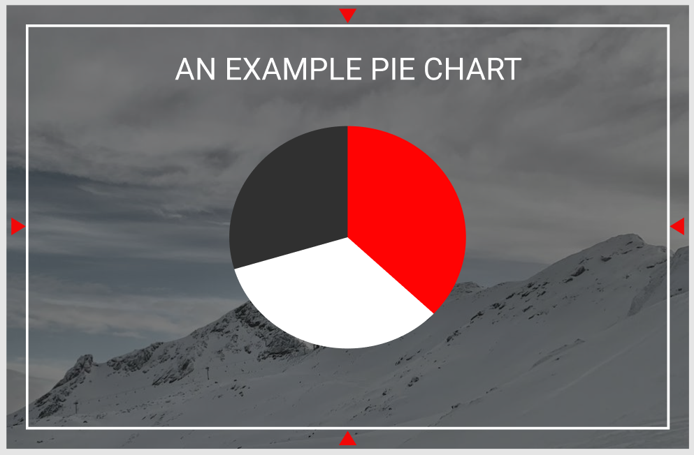
Let's look at this image and qml example below, this is a representation of the Mycroft Delegate:
-
Note the red triangles in the image above. They mark the margin from the screen edge the GUI needs to be designed within. These margins keep your GUI content from overlapping features like edge lighting and menus on platforms that support them, such as OVOS-Shell.
-
The content items and components all use the selected color scheme. Black is the primary background color, red is the accent color, and white is the contrasting text color.
Let's look at this in QML:
import ...
import Mycroft 1.0 as Mycroft

Mycroft.Delegate {
    skillBackgroundSource: sessionData.exampleImage
    leftPadding: 0
    rightPadding: 0
    topPadding: 0
    bottomPadding: 0

    Rectangle {
        anchors.fill: parent
        // Setting margins that need to be left for the screen edges
        anchors.margins: Mycroft.Units.gridUnit * 2

        //Setting a background dim using the primary theme / background color on top of the skillBackgroundSource image for better readability and contrast
        color: Qt.rgba(Kirigami.Theme.backgroundColor.r, Kirigami.Theme.backgroundColor.g, Kirigami.Theme.backgroundColor.b, 0.3)

        Kirigami.Heading {
            level: 2
            text: "An Example Pie Chart"
            anchors.top: parent.top
            anchors.left: parent.left
            anchors.right: parent.right
            height: Mycroft.Units.gridUnit * 3
            // Setting the text color to always follow the color scheme for this item displayed on the screen
            color: Kirigami.Theme.textColor
        }

        // NOTE: PieChart is a placeholder for illustration only — it is not a real
        // Kirigami/QML component shipped with ovos-gui. Substitute your own custom
        // QML item (or a real charting component) with equivalent color properties.
        PieChart {
            anchors.centerIn: parent
            pieColorMinor: Kirigami.Theme.backgroundColor // As in the image above the minor area of the pie chart uses the primary color
            pieColorMid: Kirigami.Theme.highlightColor // As in the image above the middle area is assigned the highlight or accent color
            pieColorMajor: Kirigami.Theme.textColor // As in the image above the major area is assigned the text color
        }
    }
}
QML Delegate Multi Platform and Screen Guidelines
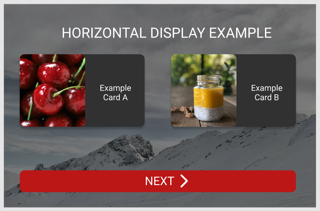
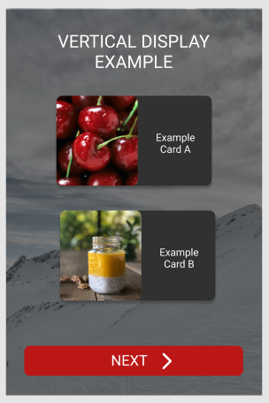
OVOS Skill GUIs are designed to be multi-platform and screen friendly, supporting both horizontal and vertical displays. Below is an example and a general approach to writing multi-resolution-friendly UIs:
Let's look at these images below that represent a Delegate as seen in a Horizontal screen:
Let's look at these images below that represent a Delegate as seen in a Vertical screen:
-
When designing for different screens, prefer Grids, GridLayouts, and GridViews. They make content placement easier because you control the number of columns and rows shown on screen.
-
Use Flickables when you expect your content not to fit on the screen. This keeps content scrollable. To make scrollable content easier to design, Mycroft GUI provides a ready-to-use
Mycroft.ScrollableDelegate. -
Also compare width to height on the root delegate item to know when the screen needs a vertical layout instead of a horizontal one.
Let's look at this in QML:
import ...
import Mycroft 1.0 as Mycroft

Mycroft.Delegate {
    id: root
    skillBackgroundSource: sessionData.exampleImage
    leftPadding: 0
    rightPadding: 0
    topPadding: 0
    bottomPadding: 0
    property bool horizontalMode: width >= height  ? 1 : 0 // Using a ternary operator to detect if width of the delegate is greater than the height, which provides if the delegate is in horizontalMode

    Rectangle {
        anchors.fill: parent
        // Setting margins that need to be left for the screen edges
        anchors.margins: Mycroft.Units.gridUnit * 2

        //Setting a background dim using the primary theme / background color on top of the skillBackgroundSource image for better readability and contrast
        color: Qt.rgba(Kirigami.Theme.backgroundColor.r, Kirigami.Theme.backgroundColor.g, Kirigami.Theme.backgroundColor.b, 0.3)

        Kirigami.Heading {
            level: 2
            text: "An Example Pie Chart"
            // Setting the text color to always follow the color scheme
            color: Kirigami.Theme.textColor
        }

        GridLayout {
            id: examplesGridView
            // When in horizontal mode, display two columns as in the image above; in vertical mode, display a single column
            columns: root.horizontalMode ? 2 : 1

            // NOTE: ExamplesDelegate is a placeholder name for illustration only —
            // it is not a real component shipped with ovos-gui. Replace it with your
            // own delegate item (e.g. a custom Rectangle/Item defined in the same file).
            Repeater {
                model: examplesModel
                delegate: ExamplesDelegate {
                    ...
                }
            }
        }
    }
}
Advanced skill displays using QML
Worked examples of Lottie animations, sliding images, paginated text, card list views, proportional/auto-fit layouts, slideshows, event handling, and resting (idle) faces are in QML Worked Examples.
Read next: Home Screen Related: QML Worked Examples · OVOS Shell · GUI Protocol · Screens on OVOS · GUI Service