Mycroft-GUI QT5
NOTE - Currently only a QT5 gui-client is available, help wanted to migrate to QT6!
Introduction to QML
The reference GUI client implementation is based on the QML user interface markup language that gives you complete freedom to create in-depth innovative interactions without boundaries or provide you with simple templates within the GUI framework that allow minimalistic display of text and images based on your skill development specifics and preferences.
QML user interface markup language is a declarative language built on top of Qt's existing strengths designed to describe the user interface of a program: both what it looks like, and how it behaves. QML provides modules that consist of sophisticated set of graphical and behavioral building elements.
Before Getting Started
A collection of resources to familiarize you with QML and Kirigami Framework.
Importing Modules
A QML module provides versioned types and JavaScript resources in a type namespace which may be used by clients who import the module. Modules make use of the QML versioning system which allows modules to be independently updated. More in-depth information about QML modules can be found here Qt QML Modules Documentation
In the code snippet example below we will look at importing some of the common modules that provide the components required to get started with our Visual User Interface.
import QtQuick 2.4
import QtQuick.Controls 2.2
import QtQuick.Layouts 1.4
import org.kde.kirigami 2.4 as Kirigami
import Mycroft 1.0 as Mycroft
import org.kde.lottie 1.0
QTQuick Module:
Qt Quick module is the standard library for writing QML applications, the module provides a visual canvas and includes types for creating and animating visual components, receiving user input, creating data models and views and delayed object instantiation. In-depth information about QtQuick can be found at Qt Quick Documentation
QTQuick.Controls Module:
The QtQuick Controls module provides a set of controls that can be used to build complete interfaces in Qt Quick. Some of the controls provided are button controls, container controls, delegate controls, indicator controls, input controls, navigation controls and more, for a complete list of controls and components provided by QtQuick Controls you can refer to QtQuick Controls 2 Guidelines
QtQuick.Layouts Module:
QtQuick Layouts are a set of QML types used to arrange items in a user interface. Some of the layouts provided by QtQuick Layouts are Column Layout, Grid Layout, Row Layout and more, for a complete list of layouts you can refer to QtQuick Layouts Documentation
Kirigami Module:
Kirigami is a set of QtQuick components for mobile and convergent applications. Kirigami is a set of high level components to make the creation of applications that look and feel great on mobile as well as desktop devices and follow the Kirigami Human Interface Guidelines
Mycroft Module:
Mycroft GUI frameworks provides a set of high level components and events system for aiding in the development of Mycroft visual skills. One of the controls provided by Mycroft GUI frameworks are Mycroft-GUI Framework Base Delegates Mycroft-GUI Framework Base Delegates Documentation
QML Lottie Module:
This provides a QML Item to render Adobe® After Effects™ animations exported as JSON with Bodymovin using the Lottie Web library. For list of all properties supported refer Lottie QML
Mycroft-GUI Framework Base Delegates
When you design your skill with QML, Mycroft-GUI frameworks provides you with some base delegates you should use when designing your GUI skill. The base delegates provide you with a basic presentation layer for your skill with some property assignments that can help you setup background images, background dim, timeout and grace time properties to give you the control you need for rendering an experience. In your GUI Skill you can use:
Mycroft.Delegate: A basic and simple page based on Kirigami.Page
Simple display Image and Text Example using Mycroft.Delegate
import Mycroft 1.0 as Mycroft

Mycroft.Delegate {
    skillBackgroundSource: sessionData.exampleImage
    ColumnLayout {
        anchors.fill: parent
        Image {
            id: imageId
            Layout.fillWidth: true
            Layout.preferredHeight: Kirigami.Units.gridUnit * 2
            source: "https://source.unsplash.com/1920x1080/?+autumn"
         }
         Label {
            id: labelId
            Layout.fillWidth: true
            Layout.preferredHeight: Kirigami.Units.gridUnit * 4
            text: "Lorem ipsum dolor sit amet, consectetur adipiscing elit, sed do eiusmod tempor incididunt ut labore et dolore magna aliqua."
        }
    }
}
Mycroft.ScrollableDelegate: A delegate that displays skill visuals in a scroll enabled Kirigami Page.
Example of using Mycroft.ScrollableDelegate
import QtQuick 2.4
import QtQuick.Controls 2.2
import QtQuick.Layouts 1.4
import org.kde.kirigami 2.4 as Kirigami
import Mycroft 1.0 as Mycroft

Mycroft.ScrollableDelegate{
    id: root
    skillBackgroundSource: sessionData.background
    property var sampleModel: sessionData.sampleBlob

    Kirigami.CardsListView {
        id: exampleListView
        Layout.fillWidth: true
        Layout.fillHeight: true
        model: sampleModel.lorem
        delegate: Kirigami.AbstractCard {
            id: rootCard
            implicitHeight: delegateItem.implicitHeight + Kirigami.Units.largeSpacing
            contentItem: Item {
                implicitWidth: parent.implicitWidth
                implicitHeight: parent.implicitHeight
                ColumnLayout {
                    id: delegateItem
                    anchors.left: parent.left
                    anchors.right: parent.right
                    anchors.top: parent.top
                    spacing: Kirigami.Units.largeSpacing
                    Kirigami.Heading {
                        id: restaurantNameLabel
                        Layout.fillWidth: true
                        text: modelData.text
                        level: 2
                        wrapMode: Text.WordWrap
                    }
                    Kirigami.Separator {
                        Layout.fillWidth: true
                    }
                    Image {
                        id: placeImage
                        source: modelData.image
                        Layout.fillWidth: true
                        Layout.preferredHeight: Kirigami.Units.gridUnit * 3
                        fillMode: Image.PreserveAspectCrop
                    }
                    Item {
                        Layout.fillWidth: true
                        Layout.preferredHeight: Kirigami.Units.gridUnit * 1
                    }
                }
            }
        }
    }
}
QML Design Guidelines
Before we dive deeper into the Design Guidelines, lets look at some concepts that a GUI developer should learn about:
Units & Theming
Units:
Mycroft.Units.GridUnit is the fundamental unit of space that should be used for all sizing inside the QML UI, expressed in pixels. Each GridUnit is predefined as 16 pixels
// Usage in QML Components example
width: Mycroft.Units.gridUnit * 2 // 32px Wide
height: Mycroft.Units.gridUnit // 16px Tall
Theming:
OVOS Shell uses a custom Kirigami Platform Theme plugin to provide global theming to all our skills and user interfaces, which also allows our GUI's to be fully compatible with the system themes on platforms that are not running the OVOS Shell.
Kirigami Theme and Color Scheme guide is extensive and can be found here
OVOS GUI's developed to follow the color scheme depend on only a subset of available colors, mainly:
-
Kirigami.Theme.backgroundColor = Primary Color (Background Color: This will always be a dark palette or light palette depending on the dark or light chosen color scheme)
-
Kirigami.Theme.highlightColor = Secondary Color (Accent Color: This will always be a standout palette that defines the themes dominating color and can be used for buttons, cards, borders, highlighted text etc.)
-
Kirigami.Theme.textColor = Text Color (This will always be an opposite palette to the selected primary color)
QML Delegate Design Best Practise
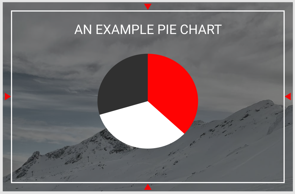
Let's look at this image and qml example below, this is a representation of the Mycroft Delegate:
-
When designing your first QML file, it is important to note the red triangles in the above image, these triangles represent the margin from the screen edge the GUI needs to be designed within, these margins ensure your GUI content does not overlap with features like edge lighting and menus in the platforms that support it like OVOS-Shell
-
The content items and components all utilize the selected color scheme, where black is the primary background color, red is our accent color and white is our contrasting text color
Let's look at this in QML:
import ...
import Mycroft 1.0 as Mycroft

Mycroft.Delegate {
    skillBackgroundSource: sessionData.exampleImage
    leftPadding: 0
    rightPadding: 0
    topPadding: 0
    bottomPadding: 0

    Rectangle {
        anchors.fill: parent
        // Setting margins that need to be left for the screen edges
        anchors.margins: Mycroft.Units.gridUnit * 2

        //Setting a background dim using our primary theme / background color on top of our skillBackgroundSource image for better readability and contrast
        color: Qt.rgba(Kirigami.Theme.backgroundColor.r, Kirigami.Theme.backgroundColor.g, Kirigami.Theme.backgroundColor.b, 0.3)

        Kirigami.Heading {
            level: 2
            text: "An Example Pie Chart"
            anchors.top: parent.top
            anchors.left: parent.left
            anchors.right: parent.right
            height: Mycroft.Units.gridUnit * 3
            // Setting the text color to always follow the color scheme for this item displayed on the screen
            color: Kirigami.Theme.textColor
        }

        PieChart {
            anchors.centerIn: parent
            pieColorMinor: Kirigami.Theme.backgroundColor // As in the image above the minor area of the pie chart uses our primary color
            pieColorMid: Kirigami.Theme.highlightColor // As in the image above the middle area is assigned the highlight or our accent color
            pieColorMajor: Kirigami.Theme.textColor // As in the image above the major area is assigned the text color
        }
    }
}
QML Delegate Multi Platform and Screen Guidelines
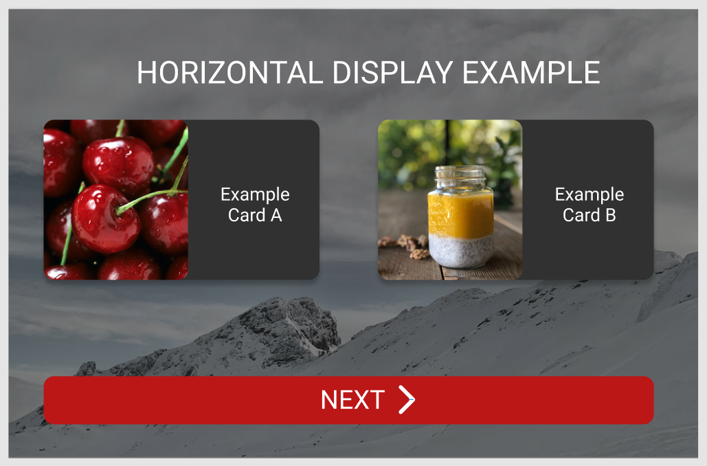
OVOS Skill GUIs are designed to be multi-platform and screen friendly, to support this we always try to support both Horizontal and Vertical display's. Let's look at an example and a general approach to writing multi resolution friendly UI's
Let's look at these images below that represent a Delegate as seen in a Horizontal screen:
Let's look at these images below that represent a Delegate as seen in a Vertical screen:
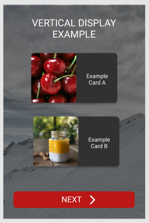
- When designing for different screens it is preferred to utilize Grids, GridLayouts and GridViews this allows easier content placement as one can control the number of columns and rows displayed on the screen
- It is also recommended to use Flickables when you believe your content is going to not fit on the screen, this allows for content to always be scrollable. To make it easier to design scrollable content, Mycroft GUI provides you with a ready to use Mycroft.ScrollableDelegate.
- It is also preferred to use the width vs height comparison on the root delegate item to know when the screen should be using a vertical layout vs horizontal layout
Let's look at this in QML:
import ...
import Mycroft 1.0 as Mycroft

Mycroft.Delegate {
    id: root
    skillBackgroundSource: sessionData.exampleImage
    leftPadding: 0
    rightPadding: 0
    topPadding: 0
    bottomPadding: 0
    property bool horizontalMode: width >= height  ? 1 : 0 // Using a ternary operator to detect if width of the delegate is greater than the height, which provides if the delegate is in horizontalMode

    Rectangle {
        anchors.fill: parent
        // Setting margins that need to be left for the screen edges
        anchors.margins: Mycroft.Units.gridUnit * 2

        //Setting a background dim using our primary theme / background color on top of our skillBackgroundSource image for better readability and contrast
        color: Qt.rgba(Kirigami.Theme.backgroundColor.r, Kirigami.Theme.backgroundColor.g, Kirigami.Theme.backgroundColor.b, 0.3)

        Kirigami.Heading {
            level: 2
            text: "An Example Pie Chart"
            // Setting the text color to always follow the color scheme
            color: Kirigami.Theme.textColor
        }

        GridLayout {
            id: examplesGridView
            // Checking if we are in horizontal mode, we should display two columns to display the items in the image above, or if we are in vertical mode, we should display a single column only
            columns: root.horizontalMode ? 2 : 1

            Repeater {
                model: examplesModel
                delegates: ExamplesDelegate {
                    ...
                }
            }
        }
    }
}
Advanced skill displays using QML
Display Lottie Animations:
You can use the LottieAnimation item just like any other QtQuick element, such as an Image and place it in your scene any way you please.
QML Example
import QtQuick 2.4
import QtQuick.Controls 2.2
import QtQuick.Layouts 1.4
import org.kde.kirigami 2.4 as Kirigami
import Mycroft 1.0 as Mycroft
import org.kde.lottie 1.0

Mycroft.Delegate {
    LottieAnimation {
        id: fancyAnimation
        anchors.fill: parent
        source: Qt.resolvedUrl("animations/fancy_animation.json")
        loops: Animation.Infinite
        fillMode: Image.PreserveAspectFit
        running: true
    }
}
Display Sliding Images
Contains an image that will slowly scroll in order to be shown completely
QML Example
import QtQuick 2.4
import QtQuick.Controls 2.2
import QtQuick.Layouts 1.4
import org.kde.kirigami 2.4 as Kirigami
import Mycroft 1.0 as Mycroft

Mycroft.Delegate {
     background: Mycroft.SlidingImage {
     source: "foo.jpg"
     running: bool    //If true the sliding animation is active
     speed: 1         //Animation speed in Kirigami.Units.gridUnit / second
   }
}
Display Paginated Text
Takes a long text and breaks it down into pages that can be horizontally swiped
QML Example
import QtQuick 2.4
import QtQuick.Controls 2.2
import QtQuick.Layouts 1.4
import org.kde.kirigami 2.4 as Kirigami
import Mycroft 1.0 as Mycroft

Mycroft.Delegate {
     Mycroft.PaginatedText {
         text: string      //The text that should be displayed
         currentIndex: 0   //The currently visible page number (starting from 0)
     }
}
Display A Vertical ListView With Information Cards
Kirigami CardsListView is a ListView which can have AbstractCard as its delegate: it will automatically assign the proper spacing and margins around the cards adhering to the design guidelines.
Python Skill Example
...
def handle_food_places(self, message):
...
self.gui["foodPlacesBlob"] = results.json
self.gui.show_page("foodplaces.qml")
...
QML Example
import QtQuick 2.4
import QtQuick.Controls 2.2
import QtQuick.Layouts 1.4
import org.kde.kirigami 2.4 as Kirigami
import Mycroft 1.0 as Mycroft

Mycroft.Delegate{
    id: root
    property var foodPlacesModel: sessionData.foodPlacesBlob

    Kirigami.CardsListView {
        id: restaurantsListView
        Layout.fillWidth: true
        Layout.fillHeight: true
        model: foodPlacesModel
        delegate: Kirigami.AbstractCard {
            id: rootCard
            implicitHeight: delegateItem.implicitHeight + Kirigami.Units.largeSpacing
            contentItem: Item {
                implicitWidth: parent.implicitWidth
                implicitHeight: parent.implicitHeight
                ColumnLayout {
                    id: delegateItem
                    anchors.left: parent.left
                    anchors.right: parent.right
                    anchors.top: parent.top
                    spacing: Kirigami.Units.smallSpacing
                    Kirigami.Heading {
                        id: restaurantNameLabel
                        Layout.fillWidth: true
                        text: modelData.name
                        level: 3
                        wrapMode: Text.WordWrap
                    }
                    Kirigami.Separator {
                        Layout.fillWidth: true
                    }
                    RowLayout {
                        Layout.fillWidth: true
                        Layout.preferredHeight: form.implicitHeight
                        Image {
                            id: placeImage
                            source: modelData.image
                            Layout.fillHeight: true
                            Layout.preferredWidth: placeImage.implicitHeight + Kirigami.Units.gridUnit * 2
                            fillMode: Image.PreserveAspectFit
                        }
                        Kirigami.Separator {
                            Layout.fillHeight: true
                        }
                        Kirigami.FormLayout {
                            id: form
                            Layout.fillWidth: true
                            Layout.minimumWidth: aCard.implicitWidth
                            Layout.alignment: Qt.AlignLeft | Qt.AlignBottom
                            Label {
                                Kirigami.FormData.label: "Description:"
                                Layout.fillWidth: true
                                wrapMode: Text.WordWrap
                                elide: Text.ElideRight
                                text: modelData.restaurantDescription
                            }
                            Label {
                                Kirigami.FormData.label: "Phone:"
                                Layout.fillWidth: true
                                wrapMode: Text.WordWrap
                                elide: Text.ElideRight
                                text: modelData.phone
                            }
                        }
                    }
                }
            }
        }
    }
}
Using Proportional Delegate For Simple Display Skills & Auto Layout
ProportionalDelegate is a delegate which has proportional padding and a columnlayout as mainItem. The delegate supports a proportionalGridUnit which is based upon its size and the contents are supposed to be scaled proportionally to the delegate size either directly or using the proportionalGridUnit.
AutoFitLabel is a label that will always scale its text size according to the item size rather than the other way around
QML Example
import QtQuick 2.4
import QtQuick.Controls 2.2
import QtQuick.Layouts 1.4
import org.kde.kirigami 2.4 as Kirigami
import Mycroft 1.0 as Mycroft

Mycroft.ProportionalDelegate {
    id: root

    Mycroft.AutoFitLabel {
        id: monthLabel
        font.weight: Font.Bold
        Layout.fillWidth: true
        Layout.preferredHeight: proportionalGridUnit * 40
        text: sessionData.month
    }

    Mycroft.AutoFitLabel {
        id: dayLabel
        font.weight: Font.Bold
        Layout.fillWidth: true
        Layout.preferredHeight: proportionalGridUnit * 40
        text: sessionData.day
    }
}
Using Slideshow Component To Show Cards Slideshow
Slideshow component lets you insert a slideshow with your custom delegate in any skill display which can be tuned to autoplay and loop and also scrolled or flicked manually by the user.
QML Example
import QtQuick 2.4
import QtQuick.Controls 2.2
import QtQuick.Layouts 1.4
import org.kde.kirigami 2.4 as Kirigami
import Mycroft 1.0 as Mycroft

Mycroft.Delegate {
    id: root

    Mycroft.SlideShow {
        id: simpleSlideShow
        model: sessionData.exampleModel // model with slideshow data
        anchors.fill: parent
        interval: 5000 // time to switch between slides
        running: true // can be set to false if one wants to swipe manually
        loop: true // can be set to play through continously or just once
        delegate: Kirigami.AbstractCard {
            width: rootItem.width
            height: rootItem.height
            contentItem: ColumnLayout {
                anchors.fill: parent
                Kirigami.Heading {
                    Layout.fillWidth: true
                    wrapMode: Text.WordWrap
                    level: 3
                    text: modelData.Title
                }
                Kirigami.Separator {
                        Layout.fillWidth: true
                        Layout.preferredHeight: 1
                }
                Image {
                    Layout.fillWidth: true
                    Layout.preferredHeight: rootItem.height / 4
                    source: modelData.Image
                    fillMode: Image.PreserveAspectCrop
                }
            }
        }
    }
}
Event Handling
Mycroft GUI API provides an Event Handling Protocol between the skill and QML display which allow Skill Authors to forward events in either direction to an event consumer. Skill Authors have the ability to create any amount of custom events. Event names that start with "system." are available to all skills, like previous/next/pick.
Simple Event Trigger Example From QML Display To Skill
Python Skill Example
    def initialize(self):
    # Initialize...
        self.gui.register_handler('skill.foo.event', self.handle_foo_event)
...
    def handle_foo_event(self, message):
        self.speak(message.data["string"])
...
...
QML Example
import QtQuick 2.4
import QtQuick.Controls 2.2
import QtQuick.Layouts 1.4
import org.kde.kirigami 2.4 as Kirigami
import Mycroft 1.0 as Mycroft

Mycroft.Delegate {
    id: root

    Button {
        anchors.fill: parent
        text: "Click Me"
        onClicked: {
            triggerGuiEvent("skill.foo.event", {"string": "Lorem ipsum dolor sit amet"})
        }
    }
}
Simple Event Trigger Example From Skill To QML Display
Python Skill Example
...
    def handle_foo_intent(self, message):
        self.gui['foobar'] = message.data.get("utterance")
        self.gui['color'] = "blue"
        self.gui.show_page("foo")
...
...
QML Example
import QtQuick 2.4
import QtQuick.Controls 2.2
import QtQuick.Layouts 1.4
import org.kde.kirigami 2.4 as Kirigami
import Mycroft 1.0 as Mycroft

Mycroft.Delegate {
    id: root
    property var fooString: sessionData.foobar

    onFooStringChanged: {
        fooRect.color = sessionData.color
    }

    Rectangle {
        id: fooRect
        anchors.fill: parent
        color: "#fff"
    }
}
Resting Faces
The resting face API provides skill authors the ability to extend their skills to supply their own customized IDLE screens that will be displayed when there is no activity on the screen.
Simple Idle Screen Example
Python Skill Example
from ovos_workshop.decorators import resting_screen_handler
...
@resting_screen_handler('NameOfIdleScreen')
def handle_idle(self, message):
    self.gui.clear()
    self.log.info('Activating foo/bar resting page')
    self.gui["exampleText"] = "This Is A Idle Screen"
    self.gui.show_page('idle.qml')
QML Example
import QtQuick 2.4
import QtQuick.Controls 2.2
import QtQuick.Layouts 1.4
import org.kde.kirigami 2.4 as Kirigami
import Mycroft 1.0 as Mycroft

Mycroft.Delegate {
    id: root
    property var fooString: sessionData.exampleText

    Kirigami.Heading {
        id: headerExample
        anchors.centerIn: parent
        text: fooString
    }
}